Increase Sales through Intuitive Design
How to improve a fashion wholesale sales app to enhance usability and drive better adoption
Balluun, the B2B marketplace platform for the tradeshow industry, had an existing digital sales pro app for their sellers that had been created two years ago. After launching, the initial interest was high, but overall adoption was very low. In order to help drive adoption, Balluun needed to streamline the process, improve usability, and provide more tools to showcase products.
APPROACH
Chobanian Group first sought to understand the live user experience on the current application while at fashion conventions. CG uncovered key insights into the current interactions, behaviors, and experiences by asking buyers and sellers questions about their met and unmet needs. In parallel, CG audited the current app design, its usability and its usage patterns. The findings showed a series of key misalignments in user flows and friction points in the overall user experience.
THE SOLUTION
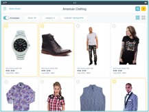
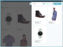
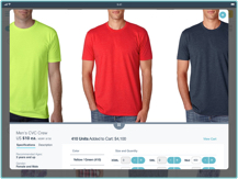
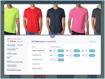
Applying the key insights learned, CG expanded and upgraded the design language across the entire app. CG made a number of updates to the app that streamlined the usability for key user flows, and incorporated best-practice design patterns that were relative to each individual task. The result was an intuitive app that was easy to use and enhanced the physical convention experience.
THE RESULTS
The new design helped increase alignment between the app and the primary desktop platform, and reduced steps and clicks by 75%. These changes have streamlined user experience, enabled more focused and intuitive communication between sellers and buyer, and ultimately increased the volume of transactions on the Balluun platform.
For more information, contact us at: hello@chobaniangroup.com


